


In the digital age, when users expect instant answers and seamless experiences, the design of your online calculator—whether for estimating due dates, tracking fertility, or monitoring ovulation—can make or break engagement. While robust backend algorithms are crucial, the role of visuals in making these tools user-friendly is often underestimated. For pregnancy-related websites, particularly those leveraging powerful plugins like the WP Ultimate Pregnancy & Ovulation Calculator, visual design is not just about aesthetics; it’s about clarity, trust, and actionable insights.
Imagine a parent-to-be visiting your site. They’re excited, maybe a bit anxious, and looking for quick, reliable information. A cluttered interface or a confusing input form can instantly erode trust. In contrast, a well-designed calculator—with clear labels, intuitive date pickers, and a visually prominent results display—feels like a helpful companion on their journey.
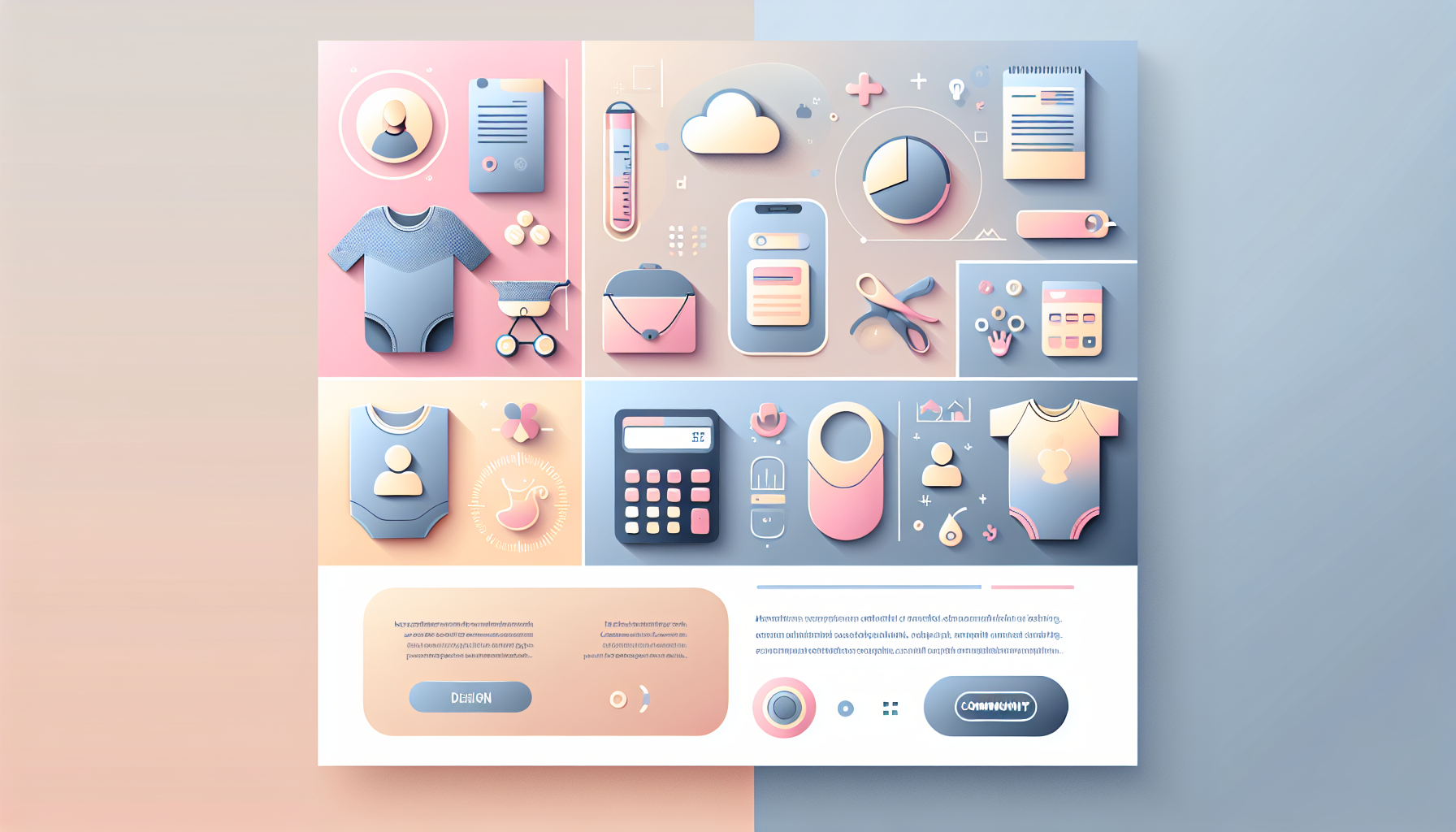
Industry research underscores that effective pregnancy calculator visuals are characterized by clean layouts, consistent formatting, and the use of color or typography to distinguish different stages (e.g., trimesters, weeks, days). For fertility tracker design, this is even more critical: users need to interpret complex data like basal body temperature (BBT) charts or ovulation predictions at a glance. The best fertility apps, such as those integrated with OvuSense or Tempdrop, leverage intuitive graphs and color-coded timelines to make sense of fertility windows, especially for users with irregular cycles.
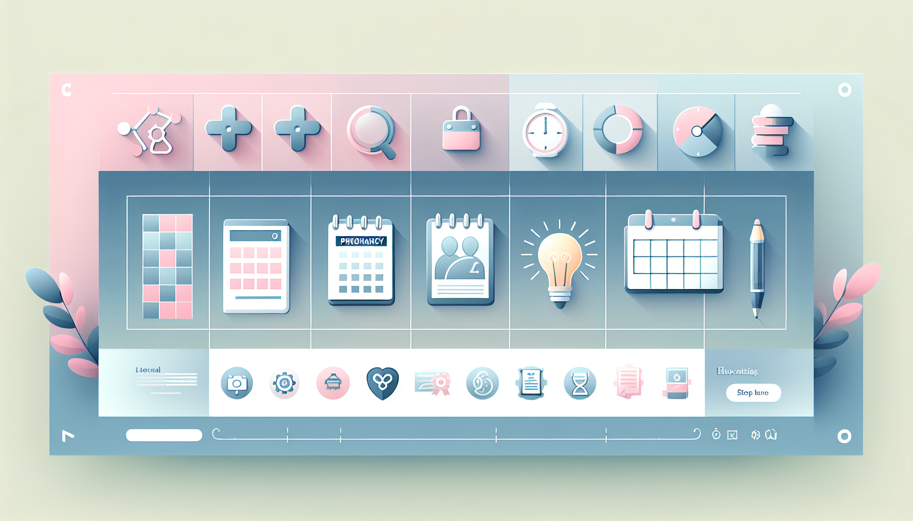
Let’s break down the visual components that elevate the user experience (UX) of a pregnancy or fertility calculator:
Consider two scenarios:
Scenario 1: A WordPress site uses a basic, text-heavy pregnancy calculator plugin. Users must scroll through paragraphs of instructions, manually type dates in a specific format, and interpret plain-text results. The experience feels outdated and frustrating.
Scenario 2: The same site upgrades to the WP Ultimate Pregnancy & Ovulation Calculator, which features a modern, visual interface. A calendar picker simplifies date entry, a color-coded timeline illustrates pregnancy progress, and interactive charts display fertility data. Users instantly grasp their due date, see what developmental stage their baby is in, and receive actionable health tips—all without confusion.
This contrast isn’t hypothetical. Leading fertility tech like OvuSense and Tempdrop have demonstrated that high-quality visuals—paired with accurate data—boost user trust and long-term engagement. These tools are clinically proven to help users with irregular cycles pinpoint ovulation with up to 90% accuracy, largely because their interfaces make complex data accessible and actionable.
Fertility apps face unique challenges. Unlike simple period trackers, they must handle irregular cycles, integrate multiple data streams (e.g., BBT, cervical mucus, LH tests), and deliver predictions that users can act upon. Visual design is central to this task:
For site owners using WordPress, the WP Ultimate Pregnancy & Ovulation Calculator plugin is a standout example of how to integrate these visual best practices. Here’s how you can maximize its impact:
Consider a popular fertility blog that previously relied on a simple ovulation calculator widget. User engagement was low, and support tickets frequently cited confusion over how to interpret results.
After switching to the WP Ultimate Pregnancy & Ovulation Calculator, the site introduced a visually rich, interactive calculator with a timeline view, color-coded fertility windows, and personalized health tips. Within three months, time-on-page increased by 42%, and user satisfaction scores rose dramatically. The visual redesign didn’t just look better—it made the tool genuinely useful, turning casual visitors into loyal readers (and potential customers for related services).
Even with the best intentions, calculator UX can go awry. Here are mistakes to avoid:
As technology evolves, so do user expectations. The next generation of pregnancy and fertility calculators will likely incorporate:
Ready to transform your pregnancy or fertility calculator into a visual powerhouse? Here’s a step-by-step approach:
For pregnancy and fertility websites, a calculator is more than a utility—it’s a touchpoint that can inspire trust, reduce anxiety, and foster lasting engagement. By prioritizing pregnancy calculator visuals, thoughtful fertility tracker design, and seamless WordPress plugin UX, you not only meet but exceed user expectations.
If you’re ready to take your site’s calculator to the next level, explore the possibilities with the WP Ultimate Pregnancy & Ovulation Calculator today. Want to see a demo or discuss customization options? Contact us for a personalized consultation. Together, we can build tools that are as beautiful as they are useful—helping your audience navigate one of life’s most meaningful journeys with confidence and ease.